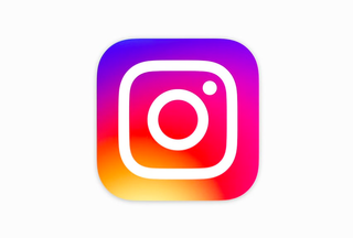
Why is everyone making such a fuss over Instagram's new icon?
But why is it so important to the photo app's users?

Instagram has changed its icon and it seems the entire universe has gone crazy about the tiny design tweak.
The company said on its blog: "Inspired by the previous app icon, the new one represents a simpler camera and the rainbow lives on in gradient form."
"We've been inspired by all the ways the community has grown and changed, and we wanted to create something that reflects how vibrant and diverse storytelling on Instagram has become," a spokesman told the media.
However, its users are a little unhappy it has changed its branding, with many taking to Twitter to express their discontent, saying the company ripped of Apple's iOS Photos icon or that it was unprofessional.
"The new instagram logo truly is gross. and i'm sure it's totally coincidence it scans as a bolder version of the iOS photos app icon," said @TonyRomm.
New Instagram icon looks like something I created in Word Art when I was 10" complained @Eryn_NotErin.
One of the icon's designers stepped in to defend it, however, saying he thinks it is just a shock to Instagram fans and they will get used to it.
Get the ITPro. daily newsletter
Receive our latest news, industry updates, featured resources and more. Sign up today to receive our FREE report on AI cyber crime & security - newly updated for 2024.
"It's kind of like the Uber redesign people freaked out, and now it's totally fine," designer and photographer Cole Rise told Mashable. "Change can be hard, and people will have to adjust to it, but I think people will love the new stuff once they get used to it on their home screens."
It is not just the icon that has changed though. Instagram has also updated the look of the app too.
"We've made improvements to how the Instagram app looks on the inside as well. The simpler design puts more focus on your photos and videos without changing how you navigate the app," the company said in its blog post.
Although Instagram users may have got used to the old branding, even that was not the original logo for the company.
Instagram CEO Kevin Systrom tried to buy a logo Rise had created for another job back in 2010, but instead, Rise suggested he create a brand new one for the photo sharing app.
"I made this brand-new imaginary camera that was Bell & Howell-inspired, with elements of the old icon so it was an easier transition,"
Rise explained he is more excited about this latest work though.
"I'm super psyched on the new one," Rise commented. "I love the minimalism. Regardless of the colors behind it, the white shape the actual bones of the new symbol itself is beautiful, and I think that can persist over time."

Clare is the founder of Blue Cactus Digital, a digital marketing company that helps ethical and sustainability-focused businesses grow their customer base.
Prior to becoming a marketer, Clare was a journalist, working at a range of mobile device-focused outlets including Know Your Mobile before moving into freelance life.
As a freelance writer, she drew on her expertise in mobility to write features and guides for ITPro, as well as regularly writing news stories on a wide range of topics.


