Are touchscreens ready for business?
Has Windows 7 made touchscreens ready for businesses, or is the tech not quite ready yet?
Productivity
Where multi-touch currently disappoints is when it comes to using standard office productivity applications. In general, we're all using larger, higher-resolution displays than we were, say, 10 years ago, so the trend in UI design is very much towards packing in more information and more options in a 2D space.
While certain UI innovations, such as the Office 2007/2010 Ribbon are complementary to touch, the general obsession with multiple task panes, option panes and preview panes is anything but. And the new Office 2010 beta shows little sign of being any more touch-friendly than its predecessor.
Sure, flick scrolling through a Word 2010 document or your Outlook 2010 inbox makes sense. But just try setting up a meeting, editing a PowerPoint presentation or formatting a spreadsheet in Excel.
The Ribbon is perfectly navigable, while the pinch-to-zoom and drag/flick gestures work exactly as they should. Yet many of the buttons are too small; the text menu items are hard to select. Tool or colour palettes are almost impossible to use accurately.
The new on-screen keyboard might be fine for typing in a single appointment, but as soon as you have to type an email or do some proper work, you'll find your fingers aching to hit some real, tangible keys.
The UI for Office is still clearly built with keyboard and mouse in mind, and as re-tailoring it for touch would involve a great deal of simplification and much less information at a glance maybe this is for the best.
Get the ITPro. daily newsletter
Receive our latest news, industry updates, featured resources and more. Sign up today to receive our FREE report on AI cyber crime & security - newly updated for 2024.
Presentations
Yet there are signs that multi-touch could come into its own when it comes to organising and presenting information, particularly with others.
This, after all, is what you'll have seen it being used for in the movies - remember the Surface-like computer in M's office in the last Bond film, Quantum of Solace?
Take a quick look at the Microsoft Office Labs and you'll see some really interesting projects that work hand in hand with touch.
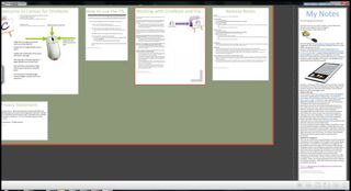
The Canvas for OneNote, for example, is a great way of organising OneNote notebooks in a more immediate, visual way, spreading out pages across a larger canvas' and allowing you to structure them in groups and containers.

The ease with which you can move around this sort of space using multi-touch, zooming quickly in and out, makes it the natural way to move around this kind of system, even if the process of actually adding and editing content is a bit clunky at the moment.
Stuart has been writing about technology for over 25 years, focusing on PC hardware, enterprise technology, education tech, cloud services and video games. Along the way he’s worked extensively with Windows, MacOS, Linux, Android and Chrome OS devices, and tested everything from laptops to laser printers, graphics cards to gaming headsets.
He’s then written about all this stuff – and more – for outlets, including PC Pro, IT Pro, Expert Reviews and The Sunday Times. He’s also written and edited books on Windows, video games and Scratch programming for younger coders. When he’s not fiddling with tech or playing games, you’ll find him working in the garden, walking, reading or watching films.
You can follow Stuart on Twitter at @SATAndrews.


