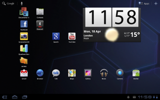
Unlike the very first Android tablets which used smartphone versions of the operating system, the Xoom uses Android 3.0 Honeycomb which is specifically tailored for tablet use. The interface generally feels logically designed, smooth and responsive, although it's still not quite up to the standard of iOS 4 on the iPad 2. For example, pinch-to-zoom and the rest of the interface in general sometimes felt sluggish while the sense of inertia when panning and zooming felt off.

A handy button in the lower left hand corner gives you a list of your five most recently-used apps, although smartphone apps are sometimes mislabelled or have garbled icons. Big widgets let you quickly view snippets of information, such as new emails and upcoming appointments, without leaving the homescreen.
Full-blown apps, such as the Exchange-compatible email and calendar apps, take advantage of the large 10in high resolution 1,280x800 pixel screen. For example, the two-pane email app lets you an keep eye on your inbox even while you're skimming a message. You can flag emails for follow-up and accept or reject Exchange meeting requests, with the calendar app updating automatically. Oddly, the calendar app lacks a list/agenda view which a feature which present in the calendar app on Android phones.
