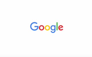
Take a look at Google's new logo
Google has unveiled a new logo that interacts with users

Everybody on the internet panic: Google's updated its logo.
Google's logo has shifted from multicolour text to multicolour text in a slightly different font - sans serif this time! - and though that sounds like a small change, it's sure to be picked apart by experts, not least as it comes at a time of major change at the company.
Last month, Google's co-founders Sergey Brin and Larry Page announced a major reorganisation, which will see the tech giant split out from other research in health sciences and self-driving cars, but under the same umbrella company, Alphabet. Indeed, the new font used in the logo is a Google invention called Product Sans, and was first unveiled in the Alphabet logo.
While Google's logo sits front and centre of its still sparse search page, the logo is often taken over by so-called Doodles commemorating historical events or innovative people. Plus, many people likely start their searches in the Awesome Bar, rather than going to Google.co.uk every single time.
Time for a change
Indeed, Google is using an animated Doodle to unveil the new logo, showing a hand wiping off the old design and redrawing the new one like it's chalk on a board.
"We think we've taken the best of Google (simple, uncluttered, colorful, friendly), and recast it not just for the Google of today, but for the Google of the future," said Tamar Yehoshua, VP of product management & Bobby Nath, director of user experience, in a post on the Google blog.
Get the ITPro. daily newsletter
Receive our latest news, industry updates, featured resources and more. Sign up today to receive our FREE report on AI cyber crime & security - newly updated for 2024.
Google said the logo is supposed to represent its evolution from a single service on a desktop PC to multiple tools across many different devices - and its sans-serif style means it will scale more easily from tiny smartwatch displays to massive smart TVs.
"As you'll see, we've taken the Google logo and branding, which were originally built for a single desktop browser page, and updated them for a world of seamless computing across an endless number of devices and different kinds of inputs (such as tap, type and talk)," Nath and Yehoshua said.
Indeed, the logo acts differently depending on what you're doing. Speak to your handset, for example, and it will morph into four coloured dots and that stretch out into an equalizer design that reacts to your voice.
Reaction
Naturally, the simple design has sparked some snark online, and Twitter users joked that Google had been "acquired by eBay", and that "whoever designed the new Google logo is on a speedboat somewhere right now, laughing, using a flaming 100 note to light a crack pipe."
Others liked it, saying "simple is better" and "the old Google logo already looks boring".
If you don't like the new design, Fast Company has a roundup the other ideas the company considered.


